

What is Fauvism?
An art movement that started in France in the early 1900s
This art movement only lasted a few years but had long lasting affects. The artists working in this style were inspired by the post-impressionist artists but took some of the same ideas even further. The Fauves (translated to Wild Beasts) used heavily saturated (or bright) colors to show how light interacts with the world around them and to also communicate their personal, emotional state of mind. This movement was all about color and believed it was the most important element of the painting! Because they were so focused on color, this led to their artworks having more simple forms and shapes, which influenced the next art movement, Cubism.

VOCABULARY
Meet Henri Matisse
Father of the Fauves
Henri Matisse is considered one of the most influential artists of the 20th century. He was a master of color and experimented and worked in a lot of different styles and mediums. You’ll notice bright, bold colors in his art, he was known for using paint directly from the tube to capture the purest colors. When talking about his work, Matisse used to say he wanted to create art that had a “calming influence on the mind.”
(Click on the images below to see them full sized)

Born: 1869 in France
"Creativity takes Courage"


Color Exploration
Fauvist artists loved color! It was very important to their artworks and they used really bright, bold colors to express themselves. Let's explore color.
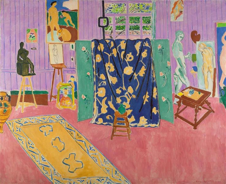
- What colors do you see?
- What feelings would you use to describe this painting?
- What do you think the artist was thinking/feeling?
- How does it make you feel?
Create a color wheel
Materials:
Mix your own colors to create a color wheel.
First get a little pinch of red, yellow, and blue clay and stick them onto the large “primary” circles on your color wheel.
Then pick two primary colors (such as red and yellow). Get small pinches of clay of each color and mix them together by squishing them between your fingers. Once you have made your new color stick it on the “secondary” circle between the two colors you chose. Repeat this process for all the primary colors to make your secondary colors. Then to make your tertiary colors, mix together a little bit of the two colors on either side of the tertiary color spot. (So you’ll mix a primary color and a secondary color together)
*If mixing primary, secondary and tertiary colors is too much for your child, there is a simplified color wheel with just primary and secondary colors.
Look at this painting by Matisse, and answer these questions:


- Printed color wheel worksheet
- Modeling clay in primary colors (red, yellow, and blue)
Warm vs Cool Colors

Henri Matisse and the Fauves knew how important and powerful color could be. In fact, the colors that they used can even tell us more about what they were painting, like what time of day it was, what season it might have been, etc.
- What colors feel warm? Which ones feel cold?
- What details do you notice?
- What season do you think it might be? Why?
- How do you think the water might feel?
Study this other painting also by Matisse, and answer these questions:
Warm colors are colors that seem like they might feel warm, like red, yellow, and orange.
Cool colors are colors that seem to be cold, like blue, and purple.
What colors do you think you would use for a sunset? How about for summer time? Winter? Night time?
Print out two copies of the Matisse inspired landscape. Try and use only warm colors on one and only cool colors on the other. You could use paint, oil pastels, watercolors, whatever you want.
How do the different colors make your artwork feel?

Materials:
- 2 printed landscape sheets
- oil pastels or paint
- paintbrush